This will be my last post on mixing secondary colors (green, purple, orange) from Premo primaries. It took me a while to prepare it because my cadmium yellow clay turned to a mustard color (far right) when fired. All clays darken a bit when fired (some more than others) but fired cadmium yellow should look like the lighter side of this picture after firing.
This experience serves to remind me to test-fire any clay I plan to use in a cane before going to all the effort of constructing the cane.
The two reds (fuchsia and cadmium red) and two yellows (zinc yellow and cadmium yellow) we’ll be mixing to produce oranges are shown below.
 Before I get to discussing oranges, though, I want to say a bit about Skinner blends.
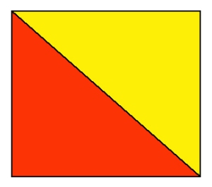
 When people think of Skinner blends many of them think of a blend mixed from two contiguous triangles of clay that look something like this. When a sheet like this is folded top to bottom and passed through the pasta machine repeatedly, a gradient from one color to the other is produced.
However, triangles are not the best way to start a Skinner blend if the desired result is a gradual, visually smooth  gradient from one color to the other. The arrangement shown above would produce a blend something like this:
Most of the sheet would be red or red-orange with very very little orange and yellow-orange. This occurs because red has so much more tinctorial power than the yellow. (While fuchsia has more tinctorial power than either of the yellows, it is much “wimpier” than cadmium red.)
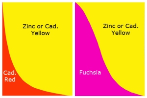
If the desired outcome of a Skinner Blend is a visually even gradient from one color to the other, a curve between the starting colors works better than straight line. All of the gradients in these posts on color mixing were produced from layouts containing curves. The layouts I used for fuchsia and cadmium red are shown below.
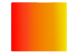
 The curve between cadmium red and yellow shown on the left produces a blend that looks like this:
![]() On my screen, oranges start appearing around 1/3 of the way along the blend, instead of 7/8 of the way across.
On my screen, oranges start appearing around 1/3 of the way along the blend, instead of 7/8 of the way across.
Here are the blends from each of the reds to cadmium yellow:
And here are the blends from each of the reds to zinc yellow:
The most vibrant (saturated) oranges occur in the blends using cadmium red rather than fuchsia. This is because fuchsia has very slight blue undertones, and blue is a third primary in the blend. As mentioned in previous posts, a third primary dulls or desaturates the blend. Cadmium red has yellow undertones which occur in oranges anyway. (I think of fuchsia as producing sunset oranges and cadmium red as producing sunflower oranges.)
The blends involving cadmium yellow are a bit brighter than those involving zinc yellow. This is because zinc yellow is more translucent than cadmium yellow and reflects less light. Adding 1/16 to 1/8 part white to the zinc yellow would brighten the blends up a bit by causing the yellow to reflect more light. Many of the Premo colors are a bit brighter after firing if you mix in a small amount of white.
I mentioned above that some colors darken more on firing than the others. Fuchsia is one of the colors that darkens the most. (Ultramarine is another.) The unfired blends from fuchsia to yellow contain sunset-like hues that are quite beautiful. When fired, however they become a bit dull because of the darkening of the fuchsia.
One final thing to note about about the fuchsia-to-yellow blends: There is a point along the gradients where the blends produce rather nice “true” reds (boxed). If these reds were used in a fuchsia-derived palette (the ones that produce the bright purples) they would appear to be quite saturated cherry reds. On the other hand, the cadmium reds can’t be modified to look like cherry-reds because of their yellow undertones.


Thank you Carol. This was very informative, as always.
Do you think that the Cad. yellow being orange was from age or just a color batch?
Would you have an idea of the mixing formula to get the cherry red?
I have also found that Alizeran Crimson darkens, usually looks browish after baking.
Thanks,
Bette
I don’t think so, because I had some that was even older that was OK. All stored the same way in my cool basement.
Bette: As far as Alizeran Crimson goes, I wouldn’t use it for saturated oranges because it has undertones of both yellow and blue (in addition to darkening dramatically upon firing.)
Thank you! This was very helpful to me. Now I know how to get what I want out of my skinner blends!
SuzW
I’m glad you found it helpful, Suz (and others). It makes it worth the effort.
Thanks Carol,
I have really been enjoying these posts. Very helpful in explaining to my students.
I was curious about some of the new colors in Premo, so I tried making a Skinner Blend with all possible combinations of the following: Cadmium Yellow, Zinc Yellow, Sunshine, Transluscent Yellow (A little too vague for my tastes); Cadmium Red, Pomagranate, Fuchsia, Candy Pink and Blush (not very impressed with this color); Blue Pearl (which is merely cobalt blue with sparklies added), Peacock Blue, Ultramarine. I purposely stuck with only colors which are now available (sigh).
You get Very Different results by changing just one primary–obviously.
My personal favorites are Sunshine, Candy Pink and Blue Pearl. I love all the colors they make (Although I admit, you don’t get a lot of dark colors from these combinations-I miss Florescent Pink!). I don’t really care for either of the Cadmiums – the colors they make are too muddy.
Thanks again. I like your tutorials a lot and I always give credit when I refer to your work.
Thank you, Byrd. I haven’t had time to work with the new colors (only look at them in the packages). Based on appearance alone, I suspect many of them are simply recombinations of old colors, some of which are no longer available. I wish Polyform had just posted recipes for the new colors, it would have left us with a lot more choices as artists. Wouldn’t it be nice if you could choose how dark your your mixtures of sunshine yellow, candy pink and blue pearl would be by deciding yourself how much white to add? Im so glad the kept blue pearl with its inimitable cobalt blue base.
Are you posting the results of your mixing trials? I would love to see them!
Carol,
Thank you, yet again!! As I’ve recently told you, I’m a new clayer, and thus don’t know many tricks of the trade yet. THANK YOU THANK YOU THANK YOU for posting the modified skinner blends. One of the things I’ve been playing with lately is making loafs, which (for other new clayers like myself 😉 would be to take those long strips and accordian fold them back & forth until finished to produce a “loaf” gradient from top to bottom. Well, the darker colors were dominating the loaves and my lighter colors were barely present! I can’t WAIT to try to manufacture my next Shady Flower Cane with this skinner technique!
And thank you for this series of posts! As I advance in my craft, I know I will be referring to these pages again and again!
Tif B
Kentucky
What a wonderful compliment,Tif. It is so satisfying to me to know that my posts are helping people see color in a new way. Thank you.
You’re welcome! You rock! And your information is VERY helpful 🙂
😉
Great post! No one seems to believe me that cadmium red is really not a primary color.
Thank you. Cad red is a bit too orange. Fuchsia is better but just a bit too blue. Watch for my next post.
Thank You This helps a lot with my skinner blends…….Kathay
Thank you for letting me know it was helpful.
thank you so much for sharing…i work alone, so info from u is so very welcome..i have forgotten about the adding of white. sometimes darkening is good for my horses and i count on it, but not always…your color sense and combining is always a joy to know about.
Thank you, Judy. It is good to hear from you and I am glad to know you are still making horses!
it’s so interesting to understand how colors change with skinner blend and your posts about them are so helpful !!thanks for sharing your experience …sev erine
You are welcome. Thank you for the comment!
Pingback: Yellow Eureka « Fulgorine
Great Information. I too would like a good cherry red recipe that Bette mentioned.
Thanks, Jay
Thank you so much for sharing. I have been fascinated with this medium since i first saw it. There is so much to learn. Unfortunately so much of it is a foreign language. A lot of people have not been born with an inate understanding of color. I find that there is more information out there on the subject which is wonderful. Another thing I struggle with is the skinner blend. I understand how to make a blend, jelly rolls, & folding it. But making the next leap to implementing these into complex canes just stumps me. I dont know if its a dimensional issue or what but it is very frustrating to not “get” what seems so obvious to everyone else. I was wondering if, with all the free time on your hands (lol) you might come up with a dvd or class on craftedu that focuses on this one specific issue or if you could point me to some videos. Thanks again for sharing your wonderful insites with us!!
Jeanne,
Thank you for your comments. I believe Judith Skinner and Sarajane Helm are working on a book about Skinner blends.
I sure hope it’s coming out, or did I miss it?
Thank you for this! I just could not figure out why the blend was not even. You made it seem so obvious…a perfect “duh” moment for me! Can’t wait to do this now, I know I will be much happier with my blends! You rock!!
I’m so glad you found it helpful, Cathy. Thank you for commenting.
Thank you for sharing Carol. This is really useful information on skinner blends.
yOU ARE WELCOME.
Perfect Skinner Blend, less “scrap” clay! Who could ask for more!! Thanks for sharing!
Welcome!
Pingback: How to Make a Pattern for a “Simmons-Skinner” Blend | Carol Simmons Designs