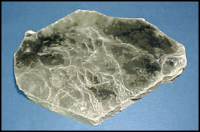
I have always loved collecting rocks and minerals. One of my favorite minerals to find is mica. Mica is responsible for the sparkle in granite and many other rocks. It mostly occurs as little tiny flakes but sometimes it occurs as pure chunks of layered mica sheets. As a child, when I was lucky enough to find such chunks I would use a needle to separate the transparent sheets, trying to obtain the largest and thinnest unbroken sheet I could.
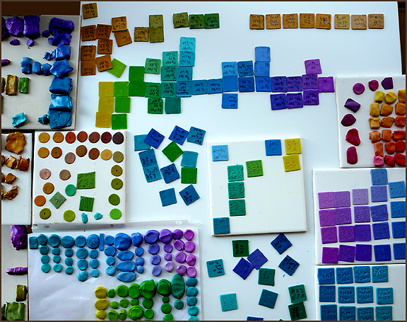
I’ve been thinking about mica a lot lately because I’ve been working with the Premo metallic/pearlescent clays and it is the mica in the clay that gives it its opalescent sheen. I’m trying to figure out what combinations of Premo colors will give me the best results from my new mokume gane technique. This is what my work area looks like right now:
 Most of the time I mix my colors instinctually (by trial and error, without measuring anything) and get both good and bad results. I don’t try to keep color “recipes” for myself. Now, however I want to be able to share what I’ve learned with others so I’m trying to quantify the composition of my favorite blends. In the rest of this post I’ll be referring to the metallic/pearlescent clay as mica clay and clay without mica as ordinary clay.
When mica clay is run through the pasta machine the mica platelets become aligned so that the flat sides of the platelets are oriented towards the top and bottom of the sheet. It is the light reflecting off of these platelets that gives the clay its opalescent shine. If you were to cut into the sheet and look at the edge it would appear darker than the top because you would be looking at the edges of the platelets which reflect very little light. This characteristic is called chatoyence or chatoyency in the polymer clay world.
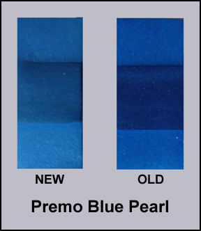
 To evaluate the chatoyency of the different Premo mica clays, I rolled the clay through the pasta machine several times to align the mica platelets horizontally. I then stacked the sheets and cut a slice vertically through the stack. I lifted and repositioned the slice so that the cut side faced up; then I placed it horizontally on top of the stack. I evaluated chatoyence as the degree of contrast in value between the slice and the original block.
As many of us had surmised, the “new” Blue Pearl produced since 2011 is not as chatoyent as the Blue Pearl produced prior to that time. In addition the new version is a lighter shade of blue and “milkier” (not as translucent) as the old version.
to be continued…


Hi, Carol
I’ve had some luck increasing chatoyence in the past by adding a small amount of translucent. I haven’t messed with the new Accent colors yet to know if that helps them, but thought I’d toss the idea out anyhow.
Sherry,
I have found that adding translucent to dried out mica clay often increases the chatoyence as well as the malleability, so you are probably right.
Thanks for commenting.
Why is it that Premo won’t fess-up to changing their formulas?
The first batch of new formulation Premo I bought is totally useless – I am stuck with over $120 worth of clay I bought to use for a class I was teaching back in 2011. I contacted the company and received nasty replies blaming me, where I live (Boston?!), and my “inexperience” (I have been claying since 1991) on the softness, poor color and brittleness of the baked product. This clay is not useable after leaching at all – the result is a flaky, weak product with a waxy, fake sheen – the mica clays especially. I even gave some to other artists to see if it was “me.” It is not. It is the product. I am interested to know – are there other brands out there that are as wonderful as the old Premo used to be? I have ceased claying due to the lack of clay out there that is artisan quality. The kids already had their Sculpey – why did they have to ruin the artists’ supplies as well?
I don’t know why they don’t admit it. It’s possible they just don’t see it. I know the Pardo company is working on developing a clay that has the advantages of the old Premo but they are not there yet. For the time being, I’m sticking with Premo and hoping that Polyform sees the light. By the way, Polyform isn’t the only company that has reacted the way you describe. I’ve heard that about other companies as well.
Thank you so much for your experimentation!!! I do not like the new Promo. many times i find it almost gummy and sticky. Just would like them to be honest. I hoarded several packages of the old pearls and colors they were going to discontinue.
I use Kato clay and like it a lot. It doesn’t darken when baked and the consistency of the clay is good throughout all the colors, except the translucent which is a little soft. There are only four mica colors, copper, gold, silver, and pearl so you have to mix your colors yourself with pearl and color concentrates.
I gave up on Premo because it was too soft but I did love their mica colors.
Do you by chance have a recipe to make the old premo blue color?
no