
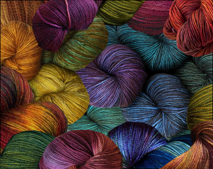
Some of you have been asking what I’ve been doing with the blends I mixed for the tide pool pieces I’ll be making. I’m still just experimenting. I started by making a few tiny canes from some of the blends; most of the canes are less than 1/4″ across after they have been reduced. I sliced off a bunch of 3/64 inch-thick slices using my slicer and started combining them on my work surface to create a design somewhat evocative of a tide pool. I immediately discovered that the blends I had made were too much alike in saturation and value to produce a clearly readable image. As a reminder, these were the blends

Tide pool color palette. Carol Simmons
and these were my inspiration pictures.

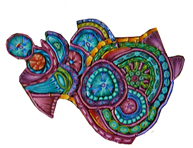
(Note: It is a bit difficult to make the following comparison on the computer. Try squinting your eyes to blur the images.)
I realized that by reducing the canes to a very small size I essentially “averaged out” the light and dark ends of the blends visually. When the canes were combined they looked more like the textile image on the left, above in which everything is similar in value, than the one on the right as I had intended. I needed to make the light ends lighter and brighter and the dark ends a bit more saturated (purer in color). Stated another way the gradients needed to be more extreme.
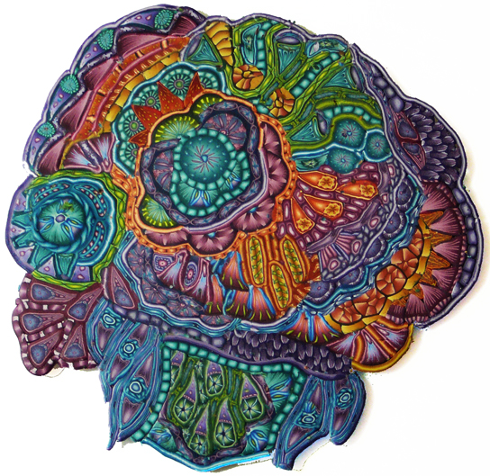
Towards this end I modified most of the remaining blends to enhance the gradients and made a few brighter ones to pick up the highlights in the yarn image. Unfortunately, I didn’t take a picture of the new set of blends. I kept the first canes since there wasn’t anything wrong with them individually, the problem was with the collection as a whole.
Right now I’m simply playing with the cane slices to see how they might go together before I begin creating the actual design. There is no overall plan to the image below, but I can see that I still need more lights.

Stunning!
Thank you Dawn.
wow — Really complex and beautiful. What a pleasure to open my mail and get to see something so magical.
Really beautiful — what a treat to open my mail to be greeted by an image so magical.
Thank you James!
Carol, this is beautiful. Your inspiration for your work is just that, inspiration. Once the creative process starts, intuition needs to take over and the original source becomes irrelevant. I love the way the lighter, brighter bits really pop. The richness you have created with the canes and the colours is superb.
I have to admit, that even after doing your workshop caning still scares me a bit. When I look back at what you do and what I learnt from you. I feel like I need to dive in and do more of it not less. Have a look at my flickr stuff and you’ll see what I mean.
I hope you have a wonderful 2014. I’m sorry that I won’t be able to come to the workshop in Racine this year. Hopefully we’ll meet again.
It is great to hear from you Jenny and thank you for the compliments. You’re right that the only way to get better at caning is to jump right in and do it, then keep doing it. I hope you have a great year also and I’m sure we’ll meet again one way or another. Thanks for writing.
It’s Beautiful Carol !! It always amazes me how much contrast you do get with out using any pure black. Will this Tide Pool be a cane that you will then kaleidoscope or are you building a project from individual slices of the small canes.
Thank you Jan. I do use black sometimes but it is always mixed with another color.
I like the new colors. Having been a painter, I almost always add a ‘mother color’ which is one color I put into each of the other colors. In that way, the colors must co-ordinate. Mostly it is an earth color which calms the other too bright colors down as well if that is the effect I am going for. I have tried it with polymer clay and it really works fine for me. I wish I could sign up for your fall class in Racine, but may be out of town in Sicily. If there are any openings left by summer, I sure would like to be a part of that as I probably will know if I am going to Europe or not. You have been an excellent teacher and I truly appreciate all you have taught me.
Thank you so much for your comment Nadine. I love the term “mother color.” Most polymer clay people call it “mud.” Adding a bit does have a unifying affect on the palette. I hope you get to go to Sicily. If not, it would be great to see you in Racine.
I first heard the term “mother color” from you, Carol, last year in Racine. It sounds so much better than “mud” and I hope the term catches on in the polymer community. I have learned so much about color mixing and use of color from you. Everyone should know it’s an integral part of your workshops.
Thanks Priscilla!
Pingback: Creating the Tide Pool Bowl
I don’t think I’ve seen such exquisite and beautiful cane work since I’ve began working with Polymer Clay. You are one of only a handful of artists that has the knack to produce this type of art. I am going to be following you so maybe I can learn something from you. I’m not very good at canes for some reason I just have problems with them. I love your bowl.
Thank you!
I particularly love two areas from the larger design. The top part with the green and yellowish “stripes” is very appealing. Also, the part on the mid right from the blue scallops out. I don’t know why these areas catch my eye. It’s just beautiful work!
Thank you, June!