(Updated 7-24-11)
I write these posts for a lot of reasons. Thinking out loud, sharing my excitement about something I’ve discovered or done, asking for feedback, and creating a reference for my students are just a few of them. In this case it is because there is some information out “there” that I consider very useful and I want to draw general attention to it. Discussing it also gives me the opportunity to review some of the points about color mixing made in previous posts.
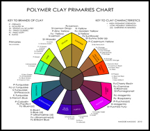
 I’m referring to this diagram (right) by Maggie Maggio. (Click image for larger version.) You can find it on p. 130 of Lindly Haunani and Maggie Maggio’s book: Polymer Clay: Color Inspirations. (All diagrams in this post are from the book and used by permission of the authors. Click this image for a larger version.) Maggie is in the process of updating the diagram to reflect recent changes in color availability. She has already added the new Premo colors. Watch her blog Smashing Color for more updates.
What makes this diagram so useful? First of all it is based on a “color wheel” of Maggie’s design (below) that is far more useful for talking about and predicting the results of color mixing with polymer clay than the traditional color wheel. It is actually a color triangle rather than a color wheel. In the literature, definitions of primary colors vary depending upon the medium being discussed (light, paint, pigment) and to some extent the writer’s biases. For the sake of this post, primary colors are colors which cannot be mixed from other colors and which when mixed with each other produce the widest range of pure (saturated) hues. Perfect primary colors are a concept rather than an actuality; they do not exist in real life.
 The primaries for polymer clay color mixing are shown in the corners of the triangle. They are the yellows, the blues and the magentas (not reds). The color names have “s”es on the end to indicate that there are no perfect primaries, just the various ones we have to work with. The secondaries (which can be mixed from the primaries) are the oranges, violets and greens. The depiction of two shades in each ray of the diagram reflects the fact that each of the colors available to us has a bias, “a little bit of another hue that causes it to lean towards that color.” (See the book for a more complete discussion of these ideas.)
Why isn’t red shown as a primary? Because as shown in the previous post, red can be mixed from Fuchsia (Fuchsia is Premo’s “magenta”) and yellow, but Fuchsia can’t be mixed from any other colors:
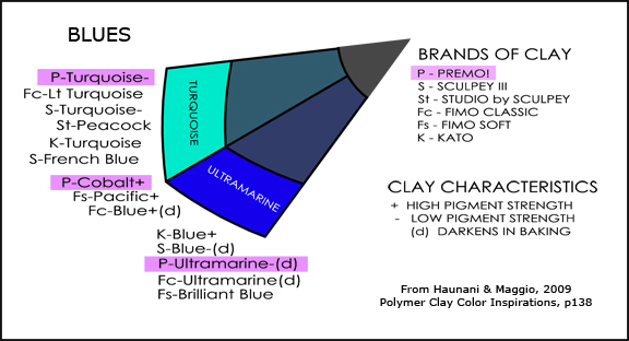
Referring back to the topmost chart at the the beginning of this post, the primary and secondary colors in the most widely available brands (in the USA) are positioned around the triangle in locations reflecting the strength of their biases towards another color. Let’s look closely at the “Blues” section as an example:
 Clay manufacturers are indicated according to the key in the upper right. For emphasis, I have highlighted Premo blues in lavender. The mid-line of the ray indicates the position of the “perfect” (nonexistent) primary blue. Blues above the line lean towards yellow; blues below the line lean towards red. The farther they are from the mid-line the more they lean towards the neighboring color. The three Premo blues are spread out across the ray: As discussed in previous posts, Turquoise leans strongly towards green/yellow, Ultramarine leans towards violet/fuchsia/red, and Cobalt Blue is close to the middle. Now that Cobalt Blue is generally unavailable, we are left with two blues that have strong undertones of another color, which causes certain mixtures to appear “muddy.” Now that you understand how the chart works, you can use it to compare the “purity” of the primaries available in other brands of clay and to some extent, to predict the outcomes of different mixtures.
 A second key on the chart points to two additional pieces of very useful information. A plus or minus symbol (+/-) next to a color name indicates whether that color (in that particular brand) has relatively high or low pigment strength. For the blues, the chart indicates that Premo Turquoise and Ultramarine have relatively low pigment strengths while Cobalt Blue has particularly high pigment strength. The diagram for Skinner blends in the previous post (on oranges) showed how important it is to know something about relative pigment strengths when mixing colors.
The second bit of useful information refers to the extent of darkening upon firing and is based upon tests conducted by Maggie. The symbol (d) indicates that the color darkens markedly upon firing. This is useful to know because colors typically lose vibrancy as they darken. These colors are the ones most likely to benefit from the addition of a small amount of white (1/16 to 1/8 part) to the package color before mixing. Premo’s Ultramarine, Purple and Fuchsia fall into this category. (Premo Zinc Yellow also benefits from the addition of a small amount of white because it is so translucent.)
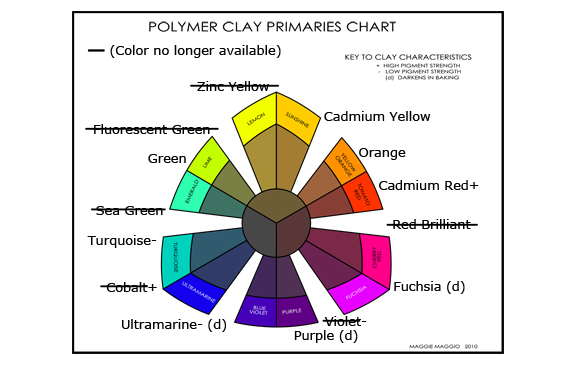
Here is the chart with only the Premo primaries and secondaries shown. Discontinued colors are crossed out.

Color attributes of Premo primaries. (Note: Although I agree with Maggie's general placement of primaries around the diagram, I would place Fuchsia slightly lower because I perceive it as being a little on the blue side of a "perfect" magenta. This is what keeps the fuchsia-based oranges from being as vibrant as they otherwise might be.)
As illustrated in previous posts, the colors closest to “perfect” primaries were Zinc Yellow, Cobalt Blue, and Fuchsia. Two of these colors have been eliminated and have not been replaced by suitable alternatives. Of the remaining colors, Cadmium Yellow is too orange, Ultramarine is too violet, Turquoise is too green, and Cadmium Red doesn’t meet our criteria for a primary.
These charts are a small part of the goldmine of information in Polymer Clay: Color Inspirations. If you want to understand how colors interact in polymer clays (and other media), I recommend you work your way through the chapters in this book. In my opinion, it is best read a bit at a time so that you have an opportunity to complete the projects and absorb the wealth of information they represent. Better yet, add a class by Lindly and Maggie to top it all off.


I recently got the Haunani/Maggio book (after a stream of reccommendations!) and I loved that the chart actually included a specific comparison of brands – I previously found it difficult to determine where the Fimo Classic colours lay in terms of the primaries, but it helped so much.
I agree. It is a wonderfully rich source of information in a small package. I guessed some people might have overlooked it because it is so close to the back of the book.
And I have no idea why I gave ‘recommendations’ another ‘c’ *eye roll* Typo madness.
I do it all the time. (Sticky fingers?)
Knowing my working habits, there was probably polymer clay jammed under the letter ‘C’ on the keyboard *G*
Your information is so clear and easy to follow with your images. This is a GREAT help to anyone working in clay, and a darn good help to anyone working in color of any medium!
Thank you so much for sharing.
Thank you Carol..once again! Denim Blue is NOT a substitute for Cobalt blue and Sunshine yellow is NOT a substitute for zinc yellow…what were they thinking when they discontinued those colors?
I agree completely, Lindly. Furthermore, Polyform promised they would post formulas for the discontinued colors but they haven’t done so for zinc yellow and cobalt blue because it is impossible.
Thanks a lot for sharing!It’s clear now!
You are so very welcome, Mimi. Thanks for the comment!
Thank you so much for your educational posts! I appreciate so much all the work that Maggie, Lindly and you have and are doing for the polymer clay community. I’m learning so much!
Thank you, Sarah. Be sure to see Maggie’s post today>
I did, thanks to your post on FB! It was very informative and encouraging! 🙂