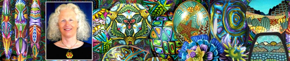
I decided to take a break from writing about color blends and do a post on the ways past students have used their color inspiration pictures. Except for the last person, these were beginning students who had little or no experience constructing canes. (All pictures can be enlarged by clicking on them.)

Glo’s Design
This is the picture Glo chose for inspiration and the cane she constructed. She was drawn to the geometric design elements in the picture and decided to include them in her cane as well.
The picture contains broad areas of shaded color and very little fine detail. Glo used muted colors, strong Skinner blends and black outlines to achieve a similar look in her design.

Jill’s Design.
This is Jill’s inspiration picture and her cane. (I had to increase the contrast and saturation in the picture so that the colors would show up well enough for you to see them in this post.) Jill was attracted to the muted pastels used for the details in this needlepoint. Since the pastels were all about the same value (degree of lightness/darkness) she had to figure out ways to increase the contrast in her cane so that the different design elements would be readily discernible. She did this with strong Skinner blends and by building detail into her component canes. The a strong linear design element she added, consisting of light yellow diamonds against a dark brown background, increases the visual impact of the overall design.

Gayle’s design.
Gayle also had to contend with very little contrast in her picture. She created contrast in her cane by adding dark outlines to many of her cane components. Because the darker lines were very narrow in proportion to the lighter areas they served to separate the different design elements while still maintaining an overall feeling of lightness and airiness. Note that the outlines are darker versions of the colors in her picture, not black.
It wasn’t until Gayle started building her component canes that she realized the colors that had attracted her to the picture (blue, lavender, rose) comprised a relatively small part of the picture, overall. She decided to cover up part of the picture and focus on the colors she liked most. (The section she covered up is not shown here.)

Lori’s Design
Lori used black outlines to separate the different elements in her design rather than varying the values of the component canes. The heavy black outlines created an attractive stained glass look in the finished cane.
Like Gayle, she chose to focus on a portion of her picture for color inspiration, but I couldn’t tell you which area it was. Clearly, though, it was one of the darker areas.
 Trina had the opposite problem from Gayle’s regarding light/dark contrast. Dark and middle-value colors predominate in her picture. Her challenge was to introduce some light elements to add contrast without losing the deep, rich overall look of the picture. She did this quite successfully by inserting light lines into many of the component canes and by shading the others to be lighter towards the center and darker towards the edges using Skinner blends.

5 Pendants
At the end of the workshop we traded cane slices so that everyone could go home and make pendants from other peoples slices in addition to their own. Shown above are some of the pendants I made from the slices I received. Can you tell which canes (and which parts) they came from?