This will be my last post on mixing secondary colors (green, purple, orange) from Premo primaries. It took me a while to prepare it because my cadmium yellow clay turned to a mustard color (far right) when fired. All clays darken a bit when fired (some more than others) but fired cadmium yellow should look like the lighter side of this picture after firing.
This experience serves to remind me to test-fire any clay I plan to use in a cane before going to all the effort of constructing the cane.
The two reds (fuchsia and cadmium red) and two yellows (zinc yellow and cadmium yellow) we’ll be mixing to produce oranges are shown below.
 Before I get to discussing oranges, though, I want to say a bit about Skinner blends.
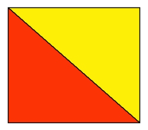
 When people think of Skinner blends many of them think of a blend mixed from two contiguous triangles of clay that look something like this. When a sheet like this is folded top to bottom and passed through the pasta machine repeatedly, a gradient from one color to the other is produced.
However, triangles are not the best way to start a Skinner blend if the desired result is a gradual, visually smooth  gradient from one color to the other. The arrangement shown above would produce a blend something like this:
Most of the sheet would be red or red-orange with very very little orange and yellow-orange. This occurs because red has so much more tinctorial power than the yellow. (While fuchsia has more tinctorial power than either of the yellows, it is much “wimpier” than cadmium red.)
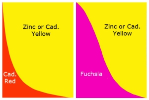
If the desired outcome of a Skinner Blend is a visually even gradient from one color to the other, a curve between the starting colors works better than straight line. All of the gradients in these posts on color mixing were produced from layouts containing curves. The layouts I used for fuchsia and cadmium red are shown below.
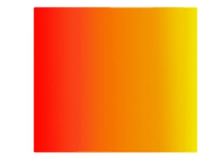
 The curve between cadmium red and yellow shown on the left produces a blend that looks like this:
![]() On my screen, oranges start appearing around 1/3 of the way along the blend, instead of 7/8 of the way across.
On my screen, oranges start appearing around 1/3 of the way along the blend, instead of 7/8 of the way across.
Here are the blends from each of the reds to cadmium yellow:
And here are the blends from each of the reds to zinc yellow:
The most vibrant (saturated) oranges occur in the blends using cadmium red rather than fuchsia. This is because fuchsia has very slight blue undertones, and blue is a third primary in the blend. As mentioned in previous posts, a third primary dulls or desaturates the blend. Cadmium red has yellow undertones which occur in oranges anyway. (I think of fuchsia as producing sunset oranges and cadmium red as producing sunflower oranges.)
The blends involving cadmium yellow are a bit brighter than those involving zinc yellow. This is because zinc yellow is more translucent than cadmium yellow and reflects less light. Adding 1/16 to 1/8 part white to the zinc yellow would brighten the blends up a bit by causing the yellow to reflect more light. Many of the Premo colors are a bit brighter after firing if you mix in a small amount of white.
I mentioned above that some colors darken more on firing than the others. Fuchsia is one of the colors that darkens the most. (Ultramarine is another.) The unfired blends from fuchsia to yellow contain sunset-like hues that are quite beautiful. When fired, however they become a bit dull because of the darkening of the fuchsia.
One final thing to note about about the fuchsia-to-yellow blends: There is a point along the gradients where the blends produce rather nice “true” reds (boxed). If these reds were used in a fuchsia-derived palette (the ones that produce the bright purples) they would appear to be quite saturated cherry reds. On the other hand, the cadmium reds can’t be modified to look like cherry-reds because of their yellow undertones.


