I know I said I would be moving away from making kaleidoscopes. However, at that time it hadn’t occurred to me that I still had kaleidoscope workshops to teach, two of them 6 days long. The second 6-day workshop was a reunion workshop for people who had already taken the first one so I had quite a bit of planning to do. As part of the planning process I identified my intentions for the construction of the master cane. They were of two types. The first had to do with illustrating/demonstrating the concepts and techniques I would be teaching in the workshop. The second set were intended to keep me from simply doing “the same old thing” and to stretch myself artistically. They were to:
- Use a colorway I hadn’t used before
- Create a palette of deep, rich colors, darker than my usual palettes
- Create stronger value gradients in my blends
- Create strong, bold graphics
- Include design elements such as dots or lines in most of the component canes
- Build a smaller master cane (with fewer components)
- Avoid using blue-violet (my favorite color)
- Do something else with the cane in addition to making kaleidoscopes
My choice of a color way was influenced by two student palettes from a previous workshop. I liked the depth and richness of Donna Harryman’s palette (left) and the tropical feeling of Priscilla Lane’s palette (right).
My palette was somewhat in between the two. For my color inspiration I brought the picture shown in the image below (a fiber art piece by Betty Busby). (I modified it slightly by making it a bit darker and less saturated in Photoshop.) I always name my palettes. I call this one tropical autumn.
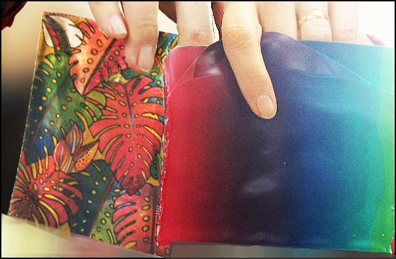 The Premo primaries I used were cadmium yellow, pomegranate, and ultramarine. I also used a bit of fuchsia to brighten the pomegranate in some areas. I made the blends for my cane during demonstrations of how to modify Skinner blends and mute colors by adding their complements. Unfortunately, the picture above is the only picture I have of my blends.
  However; the image on the right will give you a pretty good idea of what the blends looked like. (I didn’t use all of the canes in the final master cane.)
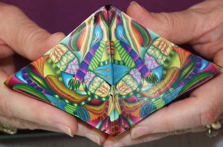
I followed my inspiration picture quite closely when mixing my color blends. The only intentional deviation was adding a brighter yellow (the flower) to increase the range of values in the final cane. Looking over the components, I decided the row of large yellow dots against the dark blue background would be too bold compared to the other canes so I took it out, modified it, and used it a different way. I flattened and reduced it then inserted it into another finished component that originally didn’t have as much value contrast as I wanted. Can you pick out the component?
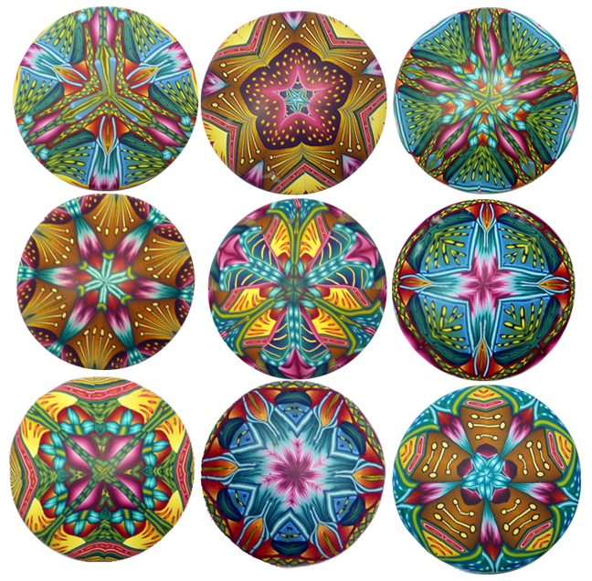
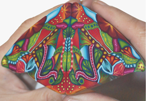
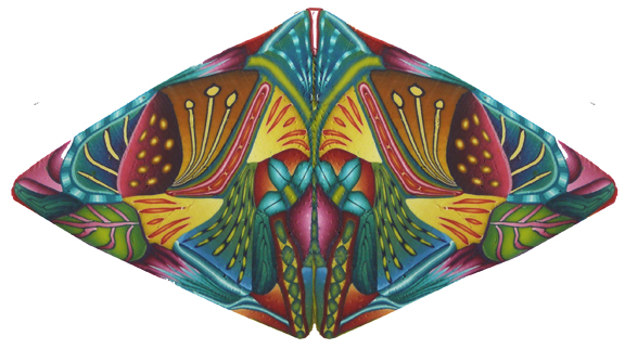 On the left is the final cane design (reduced and mirrored). It has far fewer components than the master cane I was describing in previous posts. Nevertheless I got more than 40 different kaleidoscope designs from it as well as some other designs you’ll see in a future post. I ran out of clay before I ran out of kaleidoscope possibilities.
As for my intentions, I was quite pleased with most of the results. I felt I had had the least success in my efforts to create strong value contrasts in my component canes. Overall however, I achieved the results I wanted.
A number of the speakers at the Synergy 3 conference talked about the importance of identifying one’s intentions at the beginning of a project. I found it extremely valuable in this case. It helped me stay focused and become involved in the process in a deeper way. It also increased my feeling of satisfaction with the results. I felt like shouting “Yes, I did what I intended.”