For the past couple of days I’ve been mixing color blends for my next project. Usually I start a project with a color inspiration picture, i.e., a picture with a color palette that “sings” to me. I prefer pictures of paintings or fiber art because they usually include a lot of variations to the basic hues that will create richer palettes. The usual order of my process is that first I find a picture that moves me; then I use the colors in the picture to create my clay palette.
This time, I had a good idea of the palette I wanted but I didn’t have a picture to match it. I planned to mix colors inspired by my memories of tide pools I explored as a child. I visualized varied blues, greens and turquoises, along with smaller amounts of the oranges, red-violets, deep purples, soft grays and browns seen in starfish, sea urchins, seaweeds, rocks, sand and seashells. I didn’t find exactly what I wanted but I had an immediate emotional response to a tapestry titled “Highlands” by Gina Ferrari. It had the colors I wanted, but some of them only in very small patches. Nevertheless, the colors and textures were so inspiring I decided to work with the image. I’ve identified some of the the smaller bits of colors in the adapted image below. Note: This is a reduced resolution picture of a portion of the actual tapestry. Click here to see the complete original in all its beauty at higher resolution and in its proper orientation.
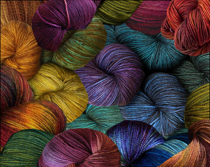
Because I couldn’t easily see all of the colors I wanted to use at a glance, I went “shopping” for yarn on Pinterest to use for an additional color reference. I combined a number of pictures to produce this collage (using Photoshop)
I haven’t made any canes yet but I have mixed my color blends. I used only the Premo primaries, black and white. All of the package colors were too bright and had to be muted. (I wanted to evoke a Pacific tide pool, not a coral reef!).
First I mixed my base colors, muting them by adding either the color’s complement or mud (a mixture of all the primaries plus a little black). I used white mixed with a very small quantity of mud to create value blends. (If I had used pure white, the colors would have appeared brighter with the addition of increasing amounts of white. I wanted them to appear lighter in value without appearing brighter so I “toned down” my white with mud.) I also made a small set of very muted colors to use as neutrals and mixed some black clay with a little orange to warm it up.
Here is my palette for my project as it currently stands, minus the “black” and muddy white. I can’t wait to start working with it when I return to my studio tomorrow!


