
Webmaster color palette via www.visibone.com
When I started working with polymer clay I was at a total loss when it came to combining colors to make a beautiful whole. Although I had taken many art classes in school I wasn’t able to transfer what I’d learned about color to polymer clay. It was only by taking many, many polymer classes having a strong emphasis on color that I developed the ability to use color effectively in my own work.
Most polymer clay classes are focused on technique, on how you manipulate the clay. The typical class supply list asks you to bring “clay in your favorite colors” or something similar. If your piece isn’t successful because of the colors you used, there is often not enough time to discuss what you might have done differently with the teacher. Even if there is time, you may be unable to fully appreciate what the teacher is telling you if you don’t know the language of color.
![]()
Understanding how to work with color is one of the surest ways to add beauty and impact to your art. Nevertheless, many students shy away from classes focused on color, thinking somehow they will figure that part out on their own.
There are a few people who do seem to have an innate ability to choose the right color combinations instinctively; I’m not one of them. When I started working with polymer, I could sense that my colors weren’t “working” but I had no idea how to fix the problem. At one point I became so frustrated I stopped working with color for 6 months, using only black, white and navy blue so I could focus on caning technique without being distracted by color combinations that weren’t working.
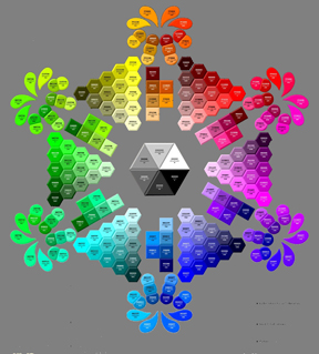
In this post, will tell you two things that did not work for me: Building a library of color recipes and working with palettes such as those below.

In the original images (above), it is the variations in hues that evoke my emotional response to the images. It is this emotional response that inspires me to create art.
In the image on the left, Spring Orchard, by Philip Craig, there are not just the one or two purples captured in the palette, there are an infinity of purples. Some are redder, some are bluer; some are brighter, some are duller; some are lighter and some are darker. It is these variations that create the richness of the image, for me. The image on the right is much simpler, color wise, however; the same limitation applies. There is not just the one blue as shown in adjoining palette. Even if you were to mix that blue with white or black to obtain a wider range of light and dark values, it wouldn’t begin to capture the the subtle blue-greens and greenish-greys, or the deep, dark-blue in the tail.
While these palettes might be very useful to architects, interior decorators, or clothing designers, they have not helped me get better at creating the beauty I want in my art. I am much better off working from the original images. Similarly, color recipes may be useful to some but not to me, as I seldom want the exact same color twice. Furthermore they tell me nothing about how to put the colors together.
This post is becoming too long; in a future post I’ll share some things that have been useful to me. Do come back!